10 Website Accessibility Factors You Need to Consider
August 31, 2020According to Worldbank.org, at least 15% of people worldwide live with a disability. That’s over 1.1 billion people with an array of unique factors that could make navigating the web more difficult than the typical web user could possibly imagine. It’s not acceptable to allow 15% of people to struggle with accessing content on the internet, especially when the fix only requires caring about the issue and putting in a little effort.
Web Content Accessibility Guidelines provide the main international standards of accessibility for web-based content. We’ve highlighted 10 of the most important accessibility factors for websites, and strongly encourage you to take a moment to evaluate your website.
1. Text contrast
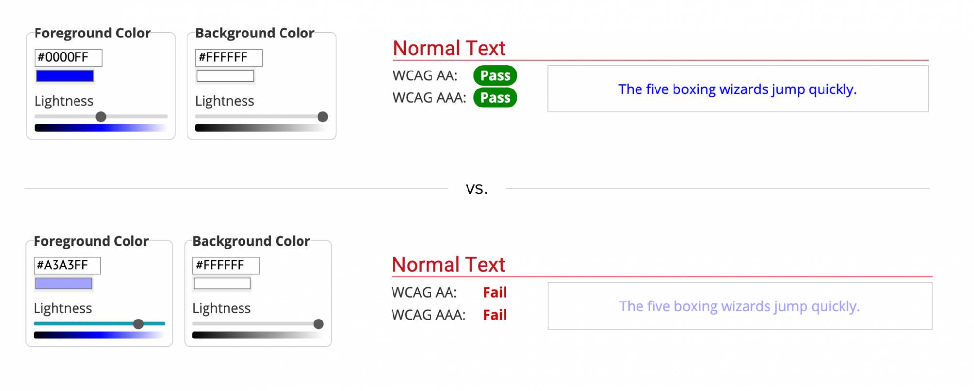
Put simply, some colors are difficult to see when placed next to each other. When multiple colors are tightly placed, it’s important that the colors contrast with each other or readability will suffer.
One easy way to check your text contrast is the Contrast Checker page from WebAIM, a prominent web accessibility organization. Enter in the colors you’re using and their tool will tell you whether the contrast is sufficient.

2. Alt text
Alt text is mostly invisible data attached to an image that describes what the image is depicting. You have almost definitely seen some before: when an image fails to load, alt text appears in its place allowing users to still understand the overall page. If you hover over an image, alt-text will appear. You should always provide alt text.
Alt text is important for a number of reasons — including SEO — but the primary reason is for accessibility. Users who have visual impairments often use ‘screen reader’ software, which essentially reads pages to them out loud. This software can only read what has been written and isn’t capable of describing images intelligently, which is what alt text is meant for.
Finding images that are missing alt text is easy thanks to website crawlers like Screaming Frog that can scour your site for them in a matter of minutes. You can learn more about the process here.

3. Highlightable interactive elements
There are many reasons why someone might be more comfortable using a keyboard to navigate a page. They may simply be more comfortable with their level of dexterity, or they may be completely unable to use a mouse.
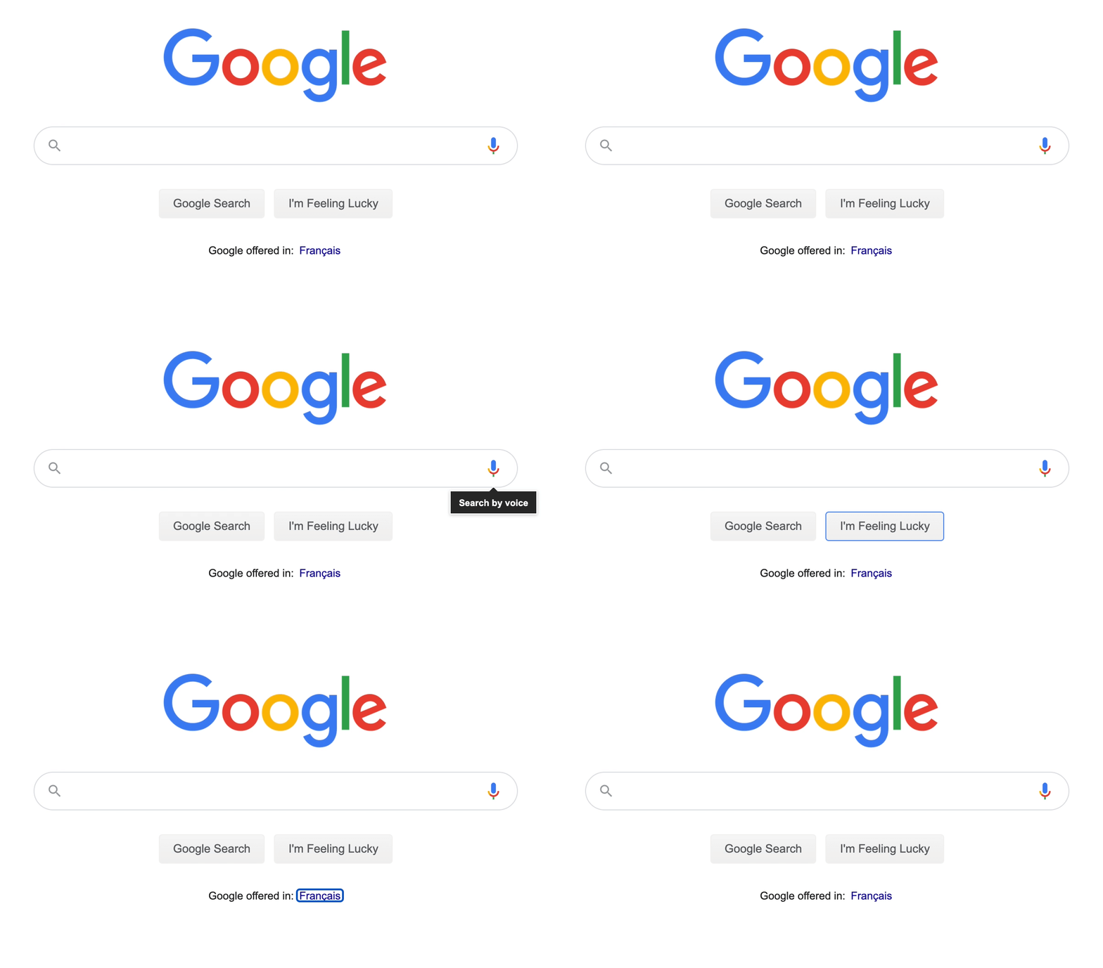
With that said, when developers disable the highlight ability for interactive elements (like buttons, hyperlinks, images) they’re excluding users who can’t navigate a page with a mouse. Keyboard-only users rely on highlights to know what part of the screen they’re going to interact with when they hit ‘enter’.
The only way to fix this issue is to avoid disabling highlighting in the first place. One of the best ways to fix and troubleshoot this—or any—accessibility issue is to explore your website as your users do. Try getting to a certain page with just a keyboard, or even better, download a screen reader browser to navigate your website entirely by voice. Note the friction points, make a plan to tackle them, and you’re well on your way to an accessible website.

4. Clean navigation
Having a clean navigational structure for your website should not be optional. Much like the previous issues we’ve detailed, navigational conventions exist for a reason: basic components like headers, footers, and breadcrumbs make it easier for everyone to browse a website. Use your navigational real estate wisely and generously.
For more information on the many elements that can enhance navigational accessibility for websites, Yale’s Usability website is a deep resource for accessibility in web development that should be bookmarked by every developer.

5. Obvious clickable elements
A ‘clickable element’—anything that can be clicked to take an action, such as submitting a form or navigating to a new page—should be obvious. Most of the time, a hyperlink indicates what’s clickable. Images do too.
In rare cases, it might be important to have a graphic element with no text that links to another page. In these circumstances, it should be made clear that this element can be clicked on to take an action, and it should be at least somewhat evident what action will be taken when the element is clicked. If it’s not immediately obvious that clicking a certain element will result in something happening, make use of alt text and title text to help fill in the blanks.

6. UI conventions
It’s pretty universal: red means danger; green means go; underlined blue text means that you can click on that text to be taken to a related page. Although it might be unique to do something different like italicizing hyperlink text instead of underlining it, doing so makes it significantly less clear that the text is clickable.
The interface traditions of the internet make it easier for all people to understand how to get around a site, and any break from those traditions should be done cautiously and with full consideration of any possible confusion that may be introduced.

7. Clean code
Screen readers and text browsers run on software that reads the code of your website. That means the quality and hygiene of a page’s underlying codebase directly impacts how well these assistive programs work, and therefore, how easy it is for the people who use them to understand your website. Unnecessary or suboptimal elements — like empty links or auto-generated alt text — can be picked up by these browsers and make the content output confusing. Run your code through this validator to check the markup validity of your HTML.

8. Button size
Everyone has different-sized hands and different levels of dexterity. If any clickable element on a site is particularly small, or several of them are too close together, users may find it hard to click what they need to click.
W3C guidelines encourage clickable elements to be no smaller than 44 x 44 CSS pixels. That’s already very small when you consider the average thumb tip to be around 2.5cm wide, so every site should be generous with screen space to make sure people can tap what needs to be tapped.

9. Zoom functionality
As an agency that’s well-versed in creating rather beautiful websites — in our humble opinion — we understand wanting to stay true to a creative vision. That said, some people need the text, pictures, or interactive elements to be larger than they might be by default. That’s why it’s important that users can zoom in on web pages and still navigate them as normal. If a user can’t read text at the size it’s natively displayed at, and they can’t effectively zoom in to make it readable (or if zooming breaks other interactive elements,) then the site is not designed with accessibility in mind.
Nothing short of manual investigation will confirm whether your own site is zoom-friendly or not. Be the user: visit each page and zoom in to 400%. Can you still navigate the website easily? Are all of the interactive elements on every page still intact? Are there any parts of the page that you can’t view or interact with after zooming?
If the zoom function isn’t working and you’re not sure what’s wrong, Yale’s Usability website has some great tips on the most likely culprits.

10. Accessible animations
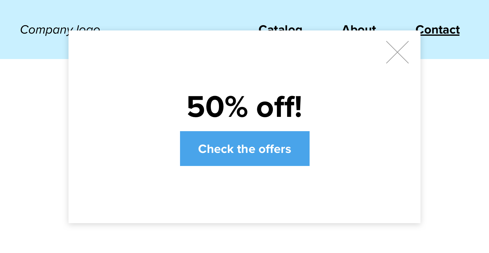
It can be very difficult to make animated elements like sliders, pop-ups, and animated text accessible. A good rule of thumb for web developers is to avoid any animated elements that require user interaction in order to navigate the site. That means don’t deploy pop-ups that cover up your header navigation and don’t make any important links move rapidly around the page. What might seem like harmless fun could cause intense frustration for some of your users.

Hopefully, you now have a more robust understanding of how to make your website more welcoming—and how you can be a champion for web accessibility, rallying site owners, designers, and developers to your banner. These steps are necessary: the UN declared internet access to be a human right in 2016. It’s the duty of all of us to make it accessible to everyone.
