BSTRO logo

Splenda

Unifying the digital world of a multi-faceted global brand.

Splenda came to us with a name known around the world, but a digital presence that was feeling increasingly fragmented. With an expanding product line, a growing presence in the culinary world, a professional relationship with nutritionists and dieticians, and an ongoing dialog with the science community, Splenda was simultaneously speaking to dozens of different audiences — without a unifying web presence to unite all its communications. To remedy this, Splenda came to BSTRO.

One website to rule them all.

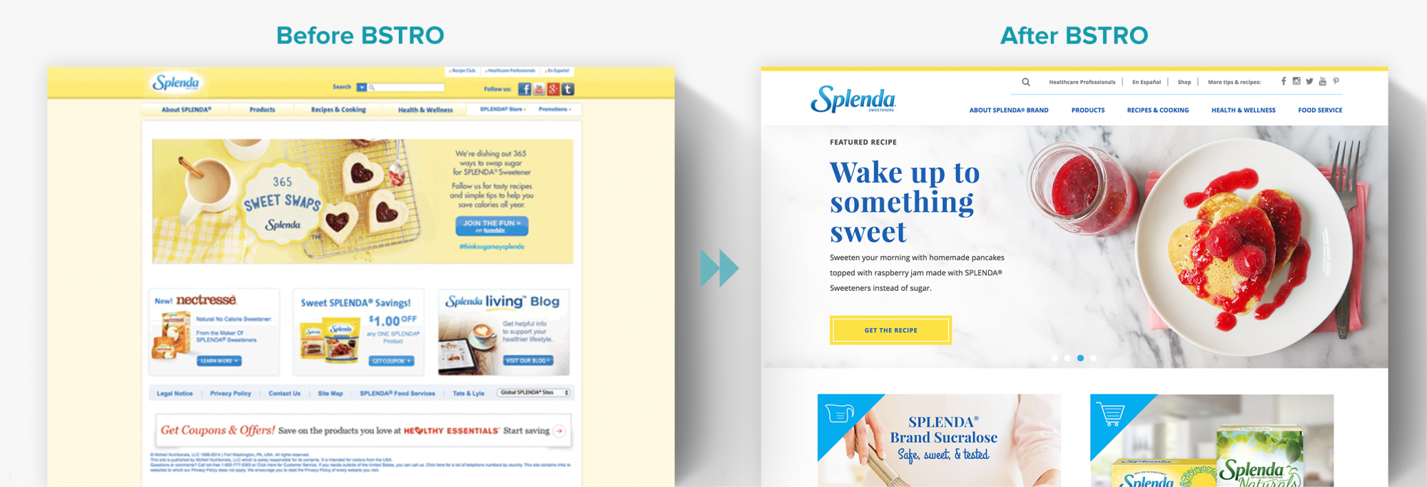
Before BSTRO embarked on the quest to create a more perfect union for them, Splenda’s content was sprinkled all over the interwebs. There was a recipe site, a safety site, and so on: It was clear Splenda needed one website to rule them all. However, doing so required a completely new approach to Splenda’s flagship site, Splenda.com. We took this opportunity and ran with it, using UX and UI design to unite Splenda’s messaging and create flexibility for new product releases and ever-expanding content types and audiences.

Intuitive experience.

Our reimagined website navigation made it easy for Splenda.com visitors to zero in on just what they were looking for — whether that was Splenda’s new online shop or its endless library of delicious recipes. In addition, interactive visual elements such as homepage rollovers helped Splenda fans easily explore and discover new content — from informative blog posts to the latest scientific findings on Splenda’s established safety.

To make it easy for the Splenda team to keep building their brand, we also made sure to equip the new Splenda.com with a reusable master template, smooth social media integration, and an engaging email opt-in experience.

Custom food photography.

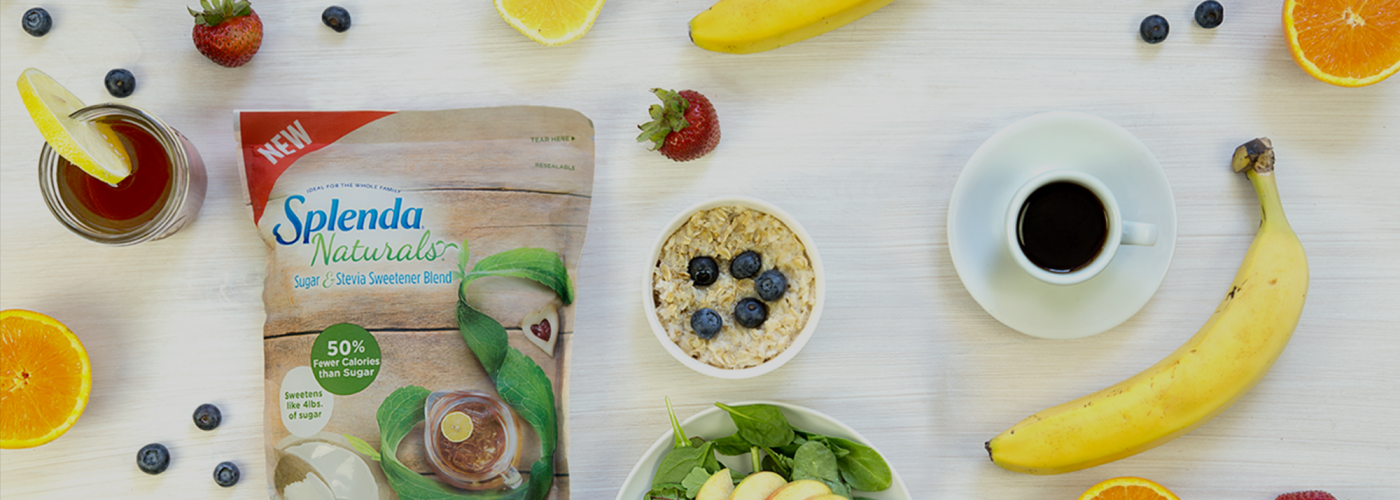
We designed the new Splenda.com to be laser-focused on sumptuous food photography. To invite visitors to explore the culinary possibilities of delicious lower sugar breakfasts, snacks, lunches, dinners, and desserts, our in-house photographers and food stylists created an entirely new library of images for Splenda’s library of 600+ recipe pages.

All together now.

The new Splenda.com did more than unite a fragmented family of websites: It presented Splenda in a whole new light. United, cohesive, fresh-faced and airy, our new site celebrates the future of Splenda.
Many happy returns.

Since the relaunch of Splenda.com, we’ve seen an 88% increase in organic traffic, an 116% increase in page views, and a 295% increase in returning visitors.

The Numbers

295%

Increase in Returning Visitors

88%

Increase in Organic Traffic

116%

Increase in Page Views

BSTRO team was incredibly collaborative and an absolute pleasure to work with. I would recommend them to any brand looking for guidance, creativity, and solid execution in the digital space.

– Luis Morales, Senior Marketing Director, SPLENDA®

RELATED CASE STUDY

Pranin Organic

Branding & UX UI Web Design

We helped Pranin draw a new audience using customer-focused content, while driving sales with a new eCommerce website.

View Case Study


Ready to build your brand?

Let’s Get Started!