
What do you do when a team of super impressive legal professionals on a mission to bring equity for women and minorities to the legal profession asks you to bid on their rebranding? If you’re BSTRO, you not only show them your team's best design, dev and UX chops — you also show them the passion and drive of a women-owned, women-led, agency with a team that's more than one-third immigrants.
At BSTRO, we love working with people on a mission to change the world — and diversity, inclusion, and equity are core to who we are! So, when the National Association of Minority and Women Owned Law Firms (NAMWOLF) chose BSTRO to elevate its brand and website (following an extensive agency review) we were elated to take on the challenge.
With NAMWOLF, our opportunity was to help this acclaimed organization show their passion and brilliance to the world — helping them grow stronger because their branding looked better, and because their website made it easier for its in-house counsel, business partners, and 3,000+ lawyers from 180+ law firms communicate and connect with each other.
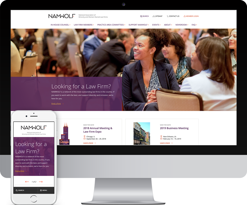
BSTRO’s creation of a new website for NAMWOLF presented the opportunity for a more efficient tool for law firm members, business partners, in-house counsel and NAMWOLF administrators — all of whom were short on time and long on to-do lists. To fulfill this opportunity, it was imperative that the site be an easy-to-use resource first and foremost, with the understanding that improved user experience, faster search, and intuitive information architecture were all critical for success.
NAMWOLF and BSTRO began the process with an extensive kickoff at the NAMWOLF Chicago offices, where we brainstormed on one intensive strategic brand exercise after another. Each exercise was uniquely designed to crystalize the NAMWOLF brand attributes and the vision for their organization, and was critical in achieving alignment among internal NAMWOLF stakeholders. The results of these exercises were equally crucial in our creation of a brand playbook that would inform messaging, tone, branding, website user experience and more, moving forward.

At BSTRO, we like to say that your visual identity is what you see when you look in the mirror, and your brand is what people say about you when you leave the room. Our challenge in rebranding NAMWOLF was to make sure that all the fantastic things people already say about NAMWOLF came through in all their materials and touchpoints — so that when the NAMWOLF stakeholders took a look at their website and branding, they could feel that their visual identity and their brand matched up cohesively.
To achieve this, we first worked with NAMWOLF to define audience personas. After defining and naming the NAMWOLF primary, secondary, and tertiary audience archetypes, we discussed their preoccupations, ideated on their environments, and analyzed their behaviors to determine how NAMWOLF’s website, branding, and materials could best speak to them.
We then set to creating the right visual tone that would speak to those audiences, while reinforcing the NAMWOLF central attributes (per our playbook). To establish a visual tone that would resonate throughout the organization and with prospective members, our design explorations started with several rounds of style tiles and mood boards to make sure that there was a shared visual language for the words described. (For example, when we say “professional,” does that connote leather chairs and smoking jackets — or is it minimalism, crispness, and clean lines?) We then presented these tiles and boards to NAMWOLF iteratively until we found the branding look and feel that resonated uniquely and completely — a visual reference point which conveyed the particularity, scope and seriousness of the NAMWOLF mission.
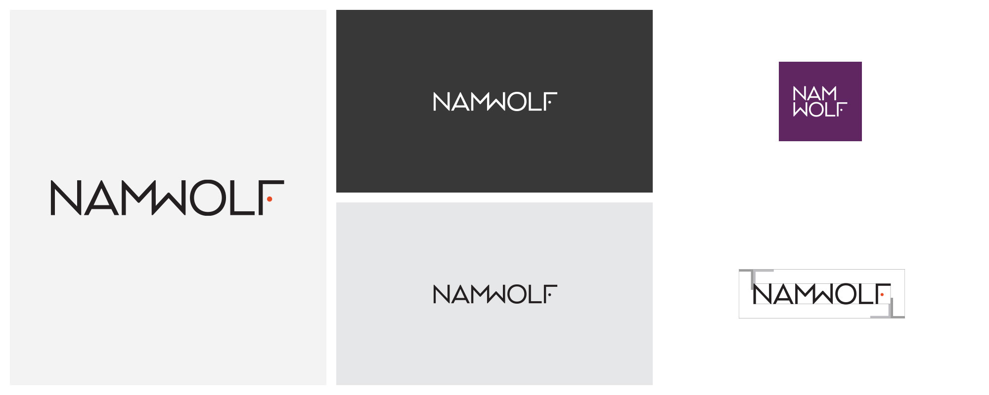
Next, we set to the task of developing a new logo for NAMWOLF. To ensure an extra dose of diversity in graphic design, we challenged design teams in two different BSTRO cities (Vancouver and San Francisco) to collaborate individually and in teams on solutions.
During this extensive exploration, we sought to create a logo that would be simple, recognizable, flexible, and reflective of the client. We knew we needed something that balanced open friendliness with formal professionalism, was minimal but recognizable, which felt welcoming, inclusive, confident and also fun — because NAMWOLF is known as a very fun organization to be a part of.
Another technical aspect of our logo design considerations were the letterforms. The M and W in the word NAMWOLF represent the “minority” and “woman” aspects of the NAMWOLF acronym, and we felt that these letters needed to be treated with distinction. However, that distinction needed to be a thoughtful one — otherwise there was the risk of this distinction throwing the logo as a whole out of equilibrium.
After many conversations and collaborations, BSTRO created a logo that reflects NAMWOLF’s attributes while taking its branding to an ultra-professional, timeless, sleek-but-fun new level. Among the reasons it works so well include:
When it came to UI, UX and information architecture on the NAMWOLF site, we wiped the slate clean and started from scratch. With the redefined NAMWOLF brand positioning always in mind, we began building information relationships anew to meet the goals of all the different users of the NAMWOLF site — from joining NAMWOLF as a minority or woman owned law firm to partnering with the organization, becoming a corporate sponsor, or participating in an event. (In fact, one of the challenges of this website project was to combine two separate websites — NAMWOLF and NAMWOLF Events — into one internal taxonomy.)
To help each audience reach their goals, we defined strategic and intuitive user paths for each persona, baking their thought processes into every UI and UX decision we made. We asked ourselves: How can we get them information faster? Make sign up easier? Downloads minimal? And so on. In this way we were able to save the visitors time, steps and energy during every interaction.
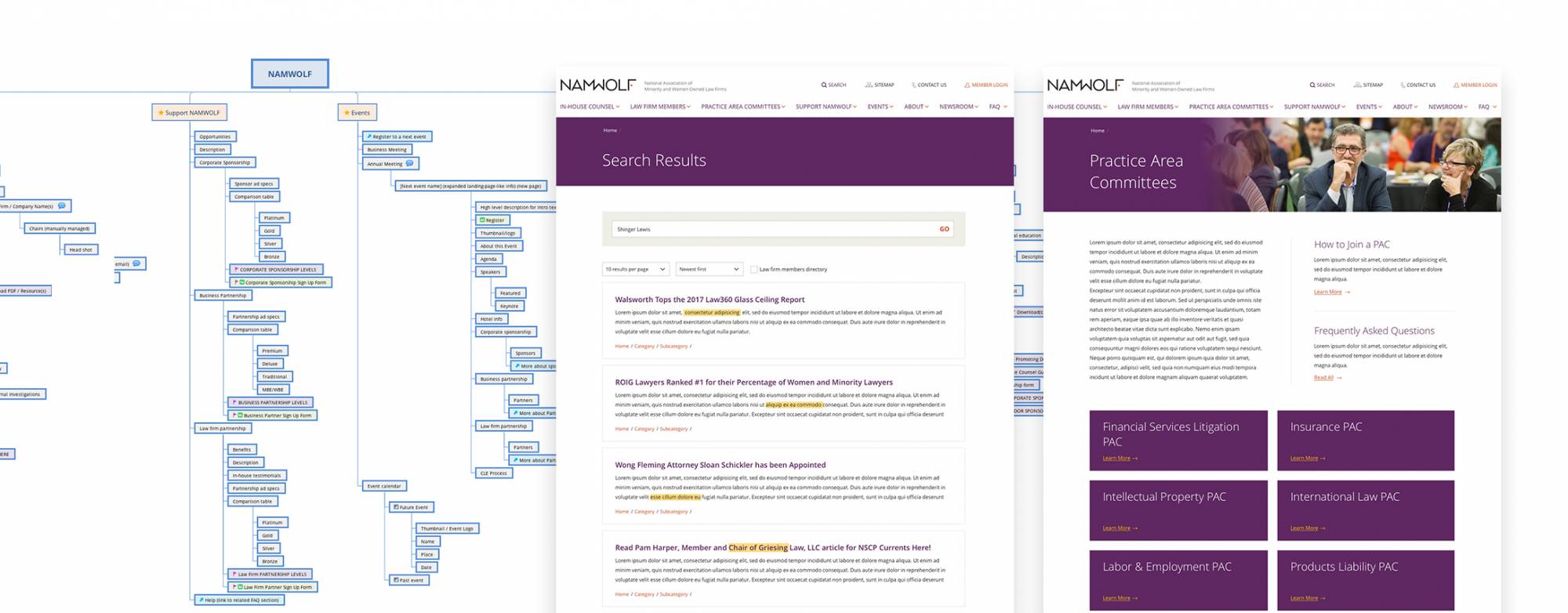
We built the new NAMWOLF website to be welcoming, genuine, and friendly — just like the organization itself. The responsive WordPress build we created for their site is also highly modular, which aligns perfectly with their dynamic company culture.
Welcoming at its core, NAMWOLF invites underrepresented voices in the legal profession to find their seat at the table. In keeping with this core attribute, BSTRO infused a sense professional quality standards and openness into every aspect of their website, especially in those pages where users were invited to submit inquiries and applications to join. We made it easy, intuitive and clear. Like it should be. BSTRO streamlined the application submission process, making it easy to fill out forms and ensuring no pertinent information was left out. In addition, every key page was supplied with a link to help, so users of all types and paths could get support for their unique needs at a moment’s notice.
To make it easy for law firm members to be found by corporations and entities, as well as each other, we fortified the site with thorough search capabilities. We also incorporated intuitive profile editing tools so each member could manage their profile online, helping themselves be found by the right people with the right keywords.
To make it easy for sponsors and individuals to support NAMWOLF, we transformed the sponsorship and partnership application process from a downloadable PDF format into an interactive and intuitive online form. Not only has this saved an enormous amount of time for all parties, it has provided a more flexible, informative experience for everyone involved.
And of course, we designed and developed the site to be beautiful — befitting a company of such powerful vision and commitment.
To keep the NAMWOLF image consistent across all communication touchpoints, we integrated email marketing automation into our work with NAMWOLF, delivering pristine email templates that have continued the visual language established in the new site.
Integrating Google Analytics and Google Tag Manager into the NAMWOLF site has allowed NAMWOLF administrators to better understand how their users interact with the site, and which areas of the site they’ve found most useful. This data has provided crucial user behavior knowledge to allow for informed, continuous website improvements over time.
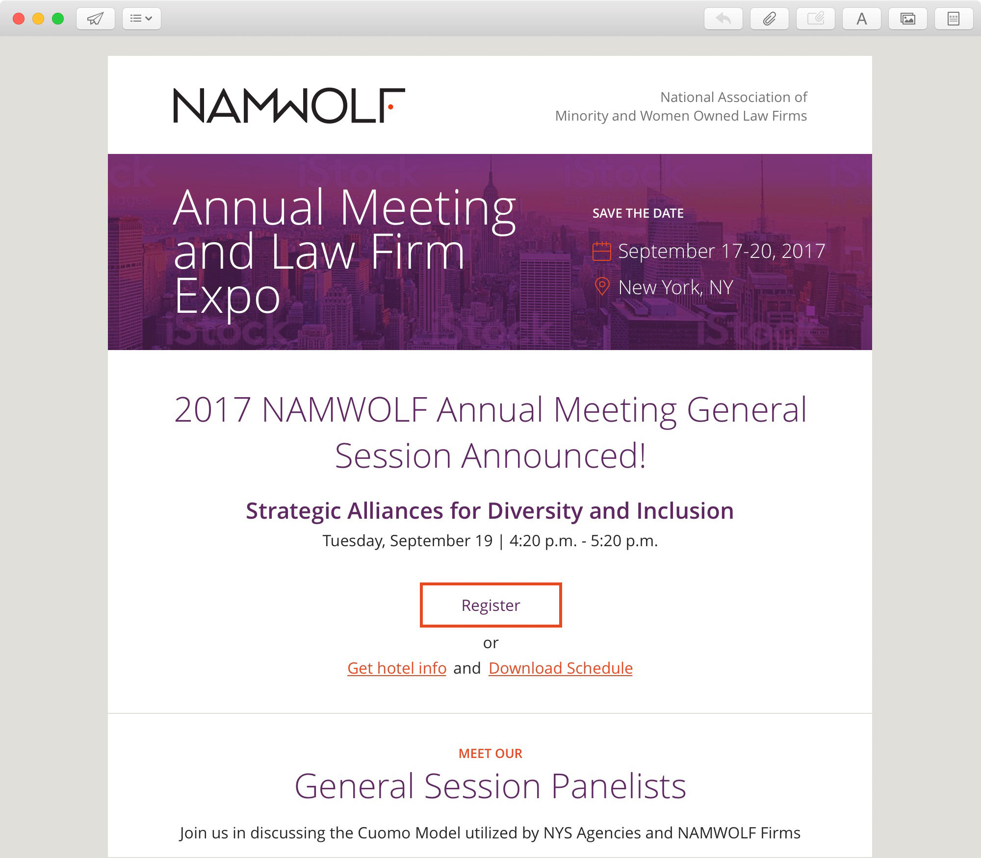
From our knowledge of NAMWOLF, gathered through intensive branding exercises and continuous close collaboration, we were able to perform a thorough evaluation of what marketing technology integrations would be most effective within the NAMWOLF site. Among our MarTech recommendations to NAMWOLF were integrations in email marketing automation, Google Analytics integration, and Google Tag Manager integration.
We loved working with NAMWOLF and are exceedingly grateful to have helped them further their mission in the world. We’re also proud to have received rave reviews on the new branding and website from association leadership and members, starting from the moment we presented it in-person at a packed NAMWOLF conference. The new website and branding continues to serve as a polished, professional, friendly and welcoming image of the association’s work in the world, and we know it’s only the beginning of their next chapter of top notch work for diversity.
“BSTRO team was incredible collaborative and an absolute pleasure to work with. I would recommend them to any brand looking for guidance, creativity, and solid execution in the digital space.”
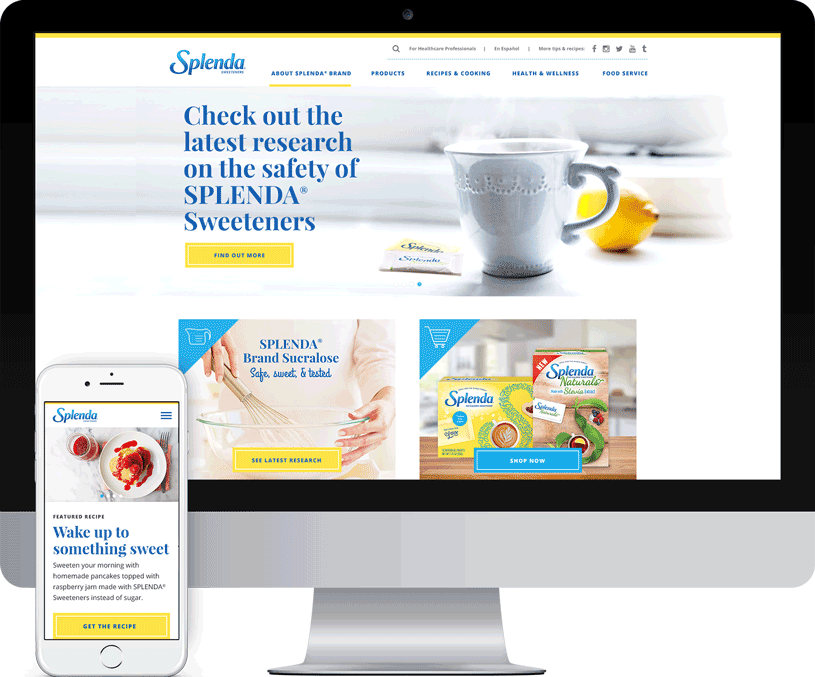
We helped Splenda unify their brand with a fresh new website that improves accessibility and shopability, while showcasing their recipes and products.