Today’s Top 5 Email Marketing Tips
November 26, 2014If you read through our recent Email about Email (Didn’t receive? Subscribe to future B’stro newsletters here), you already know that we sent the BSTRO email team to the prestigious Litmus Email Conference in Boston this year. They came back with an inbox full of learnings, and we’ve outlined the top 5 takeaways in this article. Let’s get started!
TO GET MORE PEOPLE TO OPEN…
Email Tip #1: Use preheader text
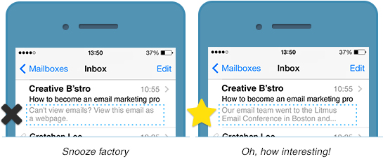
Preheader text is that little line of copy that comes after a subject line. You can see it in your inbox before you open up an email. Often, it looks like this:

Preheader text is kind of a “use it or lose it” deal, so if you don’t write your own (and implement it properly) most email clients will auto-populate this prime real estate on your behalf, using the first text that appears in your email (see “Snooze factory” example, above).
Our tip: Write your own preheader text to implement into your code. Most preheader text gets cut off by 80 or 90 characters, but we recommend going well beyond that to be sure to fill up the space available.
Here’s the full preheader text we wrote for our recent Email about Email:
Our email team went to the prestigious Litmus Email Conference in Boston and they brought back an endless well of email knowledge to better our marketing practices. In case your email team missed the conference, we’ve implemented their top 5 learnings into this email.
Not the preheader text you saw in your inbox? You may have been part of our AB testing advanced send. You can learn more about that here.
TO MAKE EMAILS MORE EXCITING…
Email Tip #2: Try progressive enhancements
|
Progressive enhancement is a coding technique in which email recipients using advanced smartphones can view optimized graphics built just for them.
The animation you see above was created using advanced CSS3 progressive enhancement code. In our Email about Email, we included this code knowing it would only trigger an animation for readers using advanced smartphones such as an iPhone running the Mail app. Everyone else viewing the email would simply see our clean, simple design—and never know about this animation.
Our tip: If your readers are using the latest smartphones to view your emails, use that to your advantage by creating interactive elements that they can see.
How can you know what devices your clients are using?
Here at B’stro, we use Litmus Analytics to create data-rich reports for our clients. These reports include a summary of which devices are being used to open our marketing emails, the average length of time readers are spending on each email, and way, way more. To learn more about our analytics reports, contact us anytime.
TO KEEP CUSTOMERS CLICKING…
Email Tip #3: Do some A-B testing

A single subject line can make or break the success of an entire email—so choosing the right one is crucial.
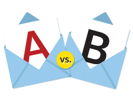
Our tip: Always do an AB subject line test for any major email send. It requires a little advanced planning, but the results are well worth the extra effort. Here’s how it works:
First, we write a hypothesis. Here’s the one we wrote for our recent Email about Email:
Since the majority of our newsletter subscribers are clients who are familiar with our agency and know our team members personally, a supremely casual subject line will resonate with them more strongly than a drier, more impersonal approach.
Then, we write two subject lines to test this hypothesis.
First, we create one subject line (A) that is supremely casual, something you might normally receive from a friend.

Then, we create a second subject line (B) that is more branded. Something a little more authoritative in tone, and definitely less person-to-person.

We sent both these subject lines to a small percentage of our database a few days before our main newsletter send. After 24 hours, we used the AB Significance Test to determine which had the highest Click to Opens rate. We then used the winning subject line in the send to the rest of our database.
Poll Time!
Which subject line would you have opened, A or B? Tell us on Facebook!
TO KEEP EMAIL BEAUTIFUL ON ANY DEVICE…
Email Tip #4: Design responsively
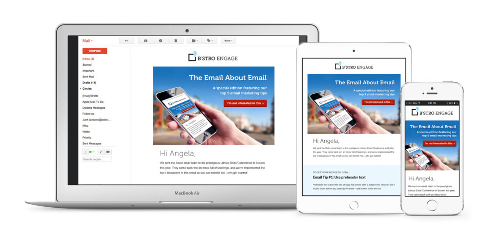
A responsive email is an email that is coded to intelligently understand what screen size it is currently being rendered on, and which uses that knowledge to adapt and reformat itself to best fit that screen.
Our Email About Email was responsive, and here’s how it looked on a variety of different devices:

Our tip: Ensure your email looks beautiful on any device by coding your marketing emails using responsive techniques.
TO MAKE YOUR GRAPHICS LOOK MORE POLISHED…
Email Tip #5: Consider retina-optimized imagery
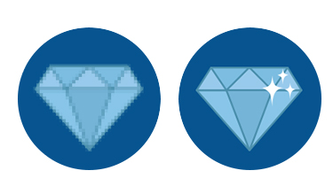
Anecdotal case studies from the Litmus Conference saw conversion rates significantly boosted when retina-optimized versus non-retina emails were tested, particularly on product shots or emotion-inspiring creative.
Our tip: If the majority of your subscriber base uses advanced smartphones with retina-optimized viewing capabilities, consider using retina-optimized imagery in your marketing emails.

Potential downsides: If many of your subscribers live in areas with sub-optimal Internet bandwidth, loading time of retina-optimized imagery may result in a drop in engagement. If you have questions on whether it’s right for you, contact us anytime!
We hope you enjoyed our Top 5 Tips for Email. Let us know in the comments what types of design or marketing tips you’d like us to share next!

